Apparel
 Auto, Home & Tools
 Bags
 Business & Office Products
 Drinkware
 Food & Candy
 Outdoor & Leisure
 Stationery
 Technology
 Toys & Novelties
 Wellness and Safety
 Writing

 Bookmarks
 Booklets
 Brochures
 Business Cards
 Custom Calendars
 Door Hangers
 Envelopes
 Event Tickets
 Flyers
 Greeting Cards
 Hang Tags
 Invitation Cards
 Labels
 Letterheads
 Magnets
 Menus
 NCR Forms
 Postcards
 Presentation Folders
 Rack Cards
 Sales Sheets
 Stickers
 Trading Cards
 Table Tents

 Banners
 Canvas
 Decals
 Event Tents
 Flags
 Posters
 Reflective Signs
 Signs
 Table Covers
 Tension Fabric Displays
 Trade Show Booths



Printing on Brown Kraft Paper: How Colors, White Ink and White Masks Really Work
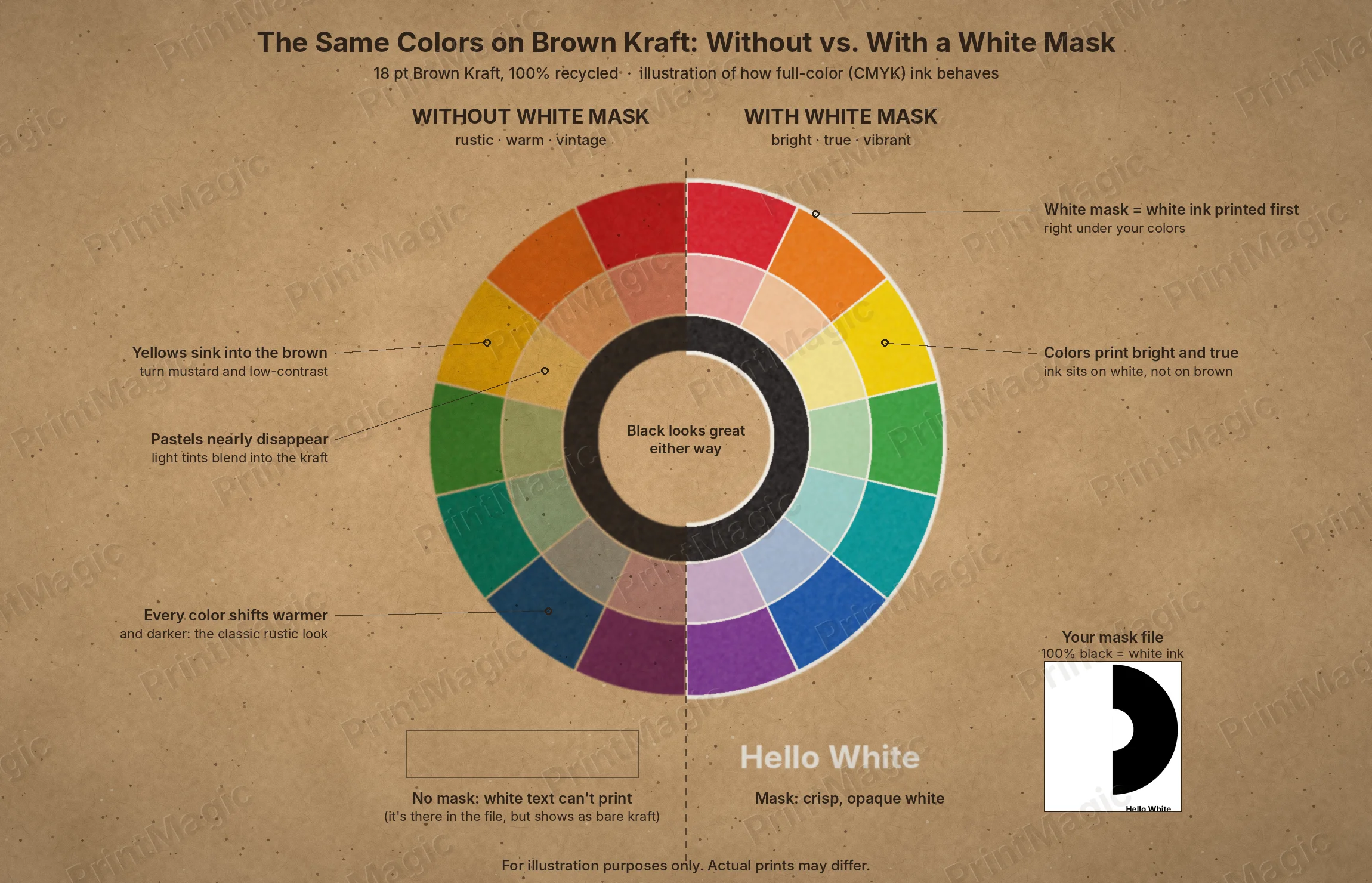
Brown kraft paper has a look that glossy white stock can’t fake: warm, natural, a little handmade. But it also behaves differently on press. Colors that look bright on your screen can come out deeper and earthier, and white, the color most designs depend on, doesn’t print at all unless you ask for it. This guide explains why, shows you exactly what changes, and walks you through the one tool that gives you full control: the white mask.
Key Takeaways
- Full-color (CMYK) ink is translucent, so on brown kraft every color mixes with the brown paper and looks warmer and darker.
- There’s no white in CMYK. White areas in your design print as bare kraft unless you add white ink.
- A white mask is white ink printed first, exactly where you choose, so colors on top look bright and true.
- No mask isn’t a mistake: the muted, vintage look is often the best fit for rustic and heritage brands.
- You set up white ink with a separate mask file: 100% black marks where white ink goes.
Why Colors Look Different on Kraft Paper
Printing presses build color by layering four translucent inks: cyan, magenta, yellow and black (CMYK). On white paper, light passes through the ink, bounces off the white sheet and comes back to your eye as clean color. The paper is invisible.
On brown kraft, the paper isn’t invisible. Light passes through the ink, bounces off a brown surface, and picks up that brown on the way back. The result is like looking at your design through a warm, amber filter. Dark colors barely change. Light colors change a lot. And white, which on white paper is simply “no ink,” becomes “no ink” on brown, so it shows as kraft.
Uncoated kraft also absorbs ink a little more than coated stock, which softens fine edges and adds a gentle, hand-printed texture to solid areas. That’s part of the charm.
What Each Color Does on Kraft (Without a White Mask)
| Color | On bare kraft | Designer tip |
|---|---|---|
| Black and charcoal | Crisp and strong, almost unchanged | Your best friend for text, line art and logos |
| Deep reds and burgundy | Rich, slightly brick-toned | Great for rustic headlines and accents |
| Bright reds and oranges | Shift toward rust and terracotta | Lovely for vintage looks; mask them if they’re brand colors |
| Yellows and golds | Turn mustard and lose contrast | Avoid yellow text without a mask; use it as a fill |
| Greens | Become olive and forest tones | Natural and earthy; good for farm and garden brands |
| Blues and teals | Darken toward navy and deep teal | Navy reads well; light blue needs a mask |
| Purples and pinks | Go dusty and muted | Mask if the exact shade matters |
| Pastels and light tints | Nearly disappear into the brown | Always mask, or choose a deeper shade |
| Skin tones and photos | Darker, sepia-like | Mask photos you want to look natural |
| White | Doesn’t print; shows as kraft | Needs a white mask, every time |
Rustic or Bright? Choosing the Look for Your Brand
Here’s the part many printers skip: the “muted” look isn’t a flaw to fix. Plenty of brands choose kraft precisely because colors soak in and look aged. Farm stands, coffee roasters, craft breweries, heritage brands and wedding stationers often print with no mask at all and design with dark, earthy inks.
Other brands need their colors exact: a bright logo, a product photo that has to match the package, white type. They use a white mask. And many use both on the same piece: a spot white mask under just the logo or photo, with everything else printed straight on kraft. See the comparison in our White Mask guide.
The 6 Printed Side Options, Explained
When you order any kraft product, you’ll choose one of six printed side options. Here’s what each one means and how many mask files it needs.
| Option | Front | Back | Mask files | Good for |
|---|---|---|---|---|
| Color on Front Only (4/0) | Full color, no white | Blank kraft | None | Rustic one-sided cards, tags and inserts |
| Color on Front & Back (4/4) | Full color, no white | Full color, no white | None | All-rustic designs with dark inks |
| Color on Front Only With White Mask | Full color + white ink | Blank kraft | 1 (front) | Bright logos, photos or white text on one side; writable back |
| Color on Front & Back With Front White Mask | Full color + white ink | Full color, no white | 1 (front) | A bright front with a rustic, text-heavy back |
| Color on Front & Back With Back White Mask | Full color, no white | Full color + white ink | 1 (back) | A vintage front with bright details on the back |
| Color & White Mask on Both Sides | Full color + white ink | Full color + white ink | 2 (front and back) | Bright, colorful designs on both sides |
How to Make a White Mask File, Step by Step
A mask file is a black-and-white map that tells the press where to lay down white ink. It’s simpler than it sounds.
- Finish your full-color artwork first. Save it as your CMYK file, for example
Logo-Front-CMYK.pdf. - Duplicate the file (or the artboard) so the mask is exactly the same size, with the same bleed.
- Decide what gets white ink: the logo, white text, a photo, a label shape, or everything.
- Fill those areas with 100% black (C0 M0 Y0 K100). Delete or turn white everything else. Black means white ink; white means bare kraft.
- Keep it solid and vector. Anything lighter than 100% K is treated as transparent, so skip gradients, tints and soft shadows in the mask. For photos, use a solid shape behind the image.
- Don’t move anything. The mask has to line up exactly with your artwork.
- Save as a vector PDF or EPS and name it to match, for example
Logo-Front-Mask.pdf. Upload both files.
Prefer not to do it yourself? Our designers can create the mask for you. Chat with us live, contact us, or read our Brown Kraft and file preparation FAQs.
Before You Upload: A Quick Checklist
- Is anything in your design meant to be white? If so, it needs a mask.
- Are pastels, yellows or light text readable on brown? If not, mask them or pick a deeper shade.
- Does your mask use only solid 100% K, with no gradients or tints?
- Do your mask and artwork match in size, bleed and position?
- Did you pick the printed side option that matches your mask files?
- Is text at least 8 pt, with no hairline details on uncoated stock?
We send a proof before anything prints, and our prepress team checks every file.
Kraft Design Ideas by Product
- Brown Kraft Business Cards: A white ink logo badge with contact details printed straight on kraft. Matches kraft bags and cups at the counter.
- Brown Kraft Postcards: A vintage, no-mask mailer with a bright, masked product photo on the front.
- Brown Kraft Invitation Cards: Names and a monogram in white ink, with details in deep brown for a rustic wedding suite.
- Flat Brown Kraft Greeting Cards: A masked “Thank You” on the front and a bare kraft back for a handwritten note.
- Folded Brown Kraft Greeting Cards: A white ink holiday cover, with the inside left natural so every card can be signed.
- Brown Kraft Bookmarks: Book cover art with a spot mask, and a reading list in black on the back.
- Brown Kraft Trading Cards: A bird or animal photo with a spot mask, framed by natural kraft for a field-guide feel.
- Brown Kraft Hang Tags: A white label shape behind the logo, with care or ingredient notes in black.
- Brown Kraft Rack Cards: A no-mask, vintage travel-poster style front for a winery, farm or trail.
- Brown Kraft Sales Sheets: Product photos masked to match the shelf, with specs in black straight on kraft.
- Recycled Brown Kraft Menus: Dark ink menu text on bare kraft, with the logo in white ink.
What “100% Recycled, 30% Post-Consumer Waste” Means
Our kraft is 100% recycled fiber, and at least 30% of that fiber is post-consumer waste: paper that people used and put in a recycling bin, like boxes, office paper and mail. The rest is recycled fiber too, typically pre-consumer fiber such as trimmings and scraps recovered from paper and print production before reaching consumers. Both keep fiber in use instead of cutting new trees for it. It’s a specific, checkable claim you can repeat with confidence when you tell customers your print is eco-friendly.
Writing, Stamping and Signing on Kraft
Because kraft is uncoated, it’s writable with any ink: ballpoint, gel, felt-tip, fountain pen, marker, pencil and rubber stamps. That’s why kraft is so popular for thank-you notes, loyalty punch cards, price tags, RSVP cards and autographed trading cards. Tip: leave writing areas free of heavy ink coverage, and test fountain pens on a proof if you plan to use a very wet nib.
Shop Brown Kraft Printing
Ready to print? Browse every product in our brown kraft printing collection, all on thick 18 pt, 100% recycled kraft. Need a custom size or quantity? Request a custom quote.
Frequently Asked Questions
Why do my colors look darker on kraft paper?
CMYK ink is translucent, so the brown paper shows through and tints every color warmer and darker. Dark colors barely change; light colors change the most. A white mask underneath restores bright, true color.
Can I print white on kraft without a white mask?
No. CMYK has no white ink, so white areas print as bare kraft. White text, white logos and white backgrounds always need a white mask.
Which printed side option should I choose?
Choose by where you need bright color or white. No white anywhere: 4/0 or 4/4. White or bright color on one side: a front or back white mask option. On both sides: Color and White Mask on Both Sides.
How many mask files do I need?
One mask file for each side that gets white ink. A front-only mask needs one file; white ink on both sides needs two.
Can I use gradients or soft shadows in a mask file?
No. The mask has to be solid 100% black. Anything lighter is treated as transparent and won’t get white ink. Use solid shapes instead.
Is the white ink fully opaque?
It’s opaque enough to make colors bright and white text crisp. On kraft, you may still see a hint of the paper’s natural texture, which is part of the look.
Is a muted, no-mask look a printing problem?
No. It’s how CMYK naturally looks on brown paper, and many brands choose it on purpose for a rustic, vintage feel.
What does post-consumer waste mean?
Paper that was used by consumers and recycled, like boxes and office paper. Our kraft is 100% recycled, with at least 30% post-consumer waste.
Will I see a proof before printing?
Yes. Every order gets a proof, and our prepress team checks your artwork and mask files before anything prints.
 Signs